The principles that guide us
-

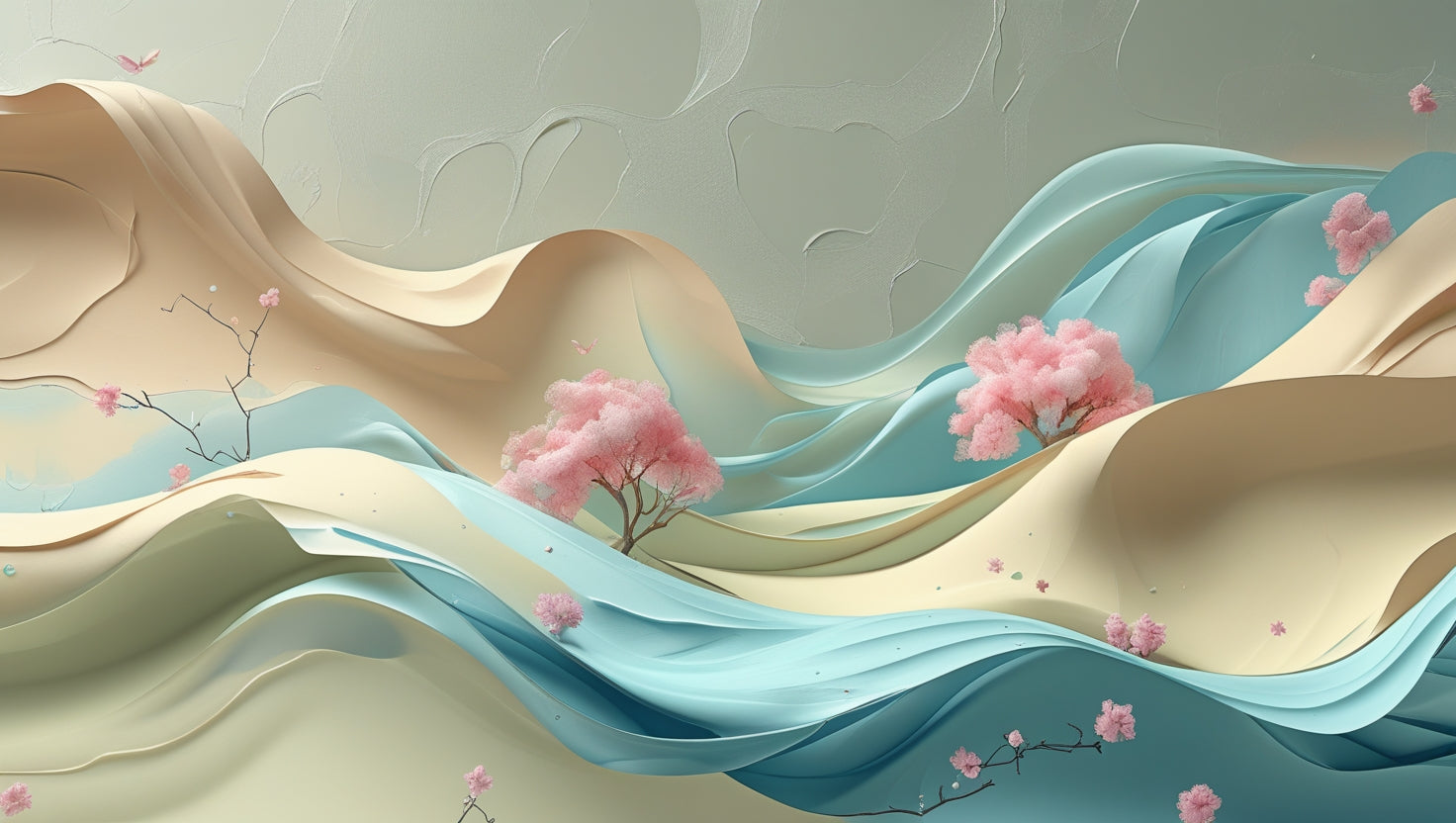
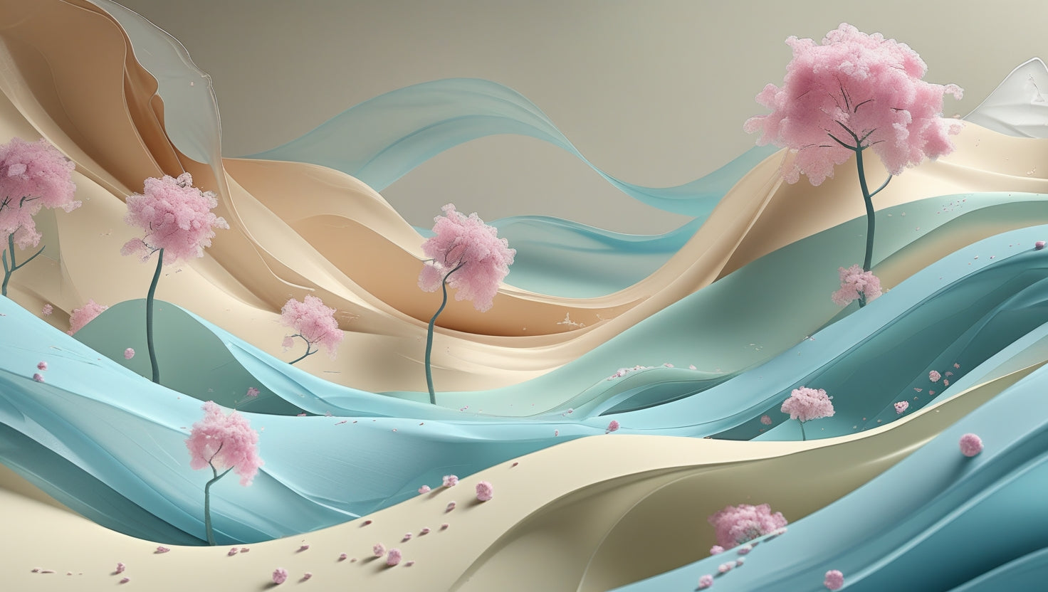
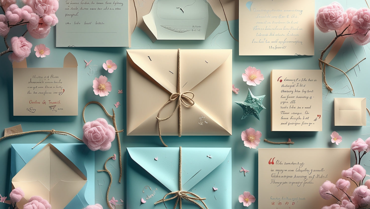
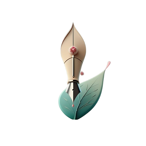
Inspired by nature
-
Hand-feel
-

Visual immersion


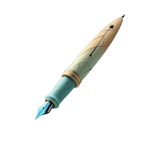
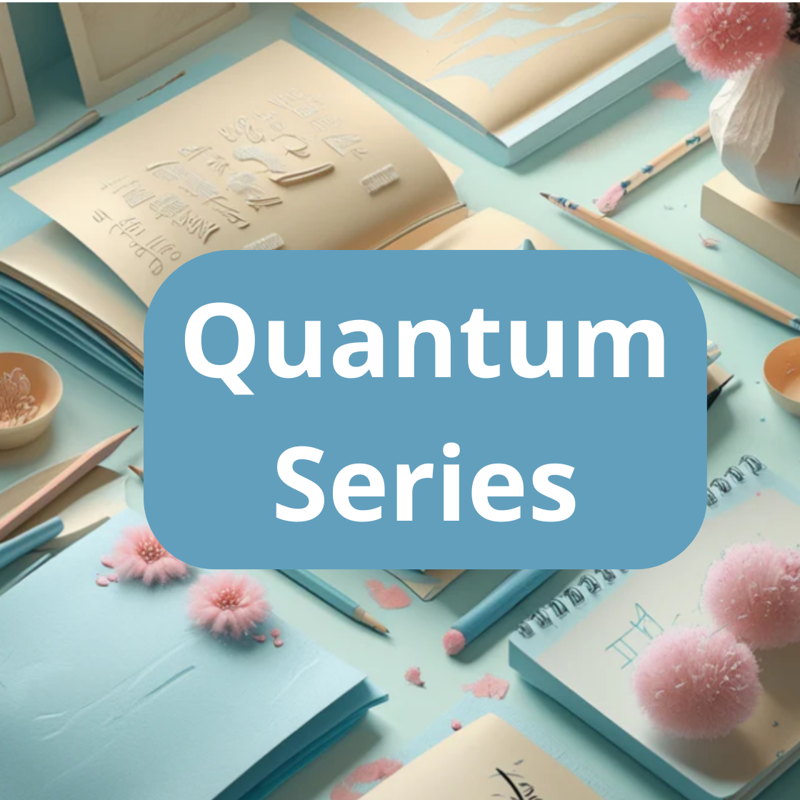
About the Typolora project
Typolora is a collection of fonts where each letter is created with respect for form and mood. We strive for each set to convey lightness, depth and expressiveness without unnecessary elements. Visual softness is the main feature of our solutions. The fonts are suitable for both digital and printed works, adapting to the composition, not the other way around.

What makes Typolora recognizable
-
Details that work together
We select elements that harmonize in the layout.
-
Easy navigation between styles
Fonts interact with each other without creating contradictions.
-
Precision of the line
Each form is carefully verified and balanced.


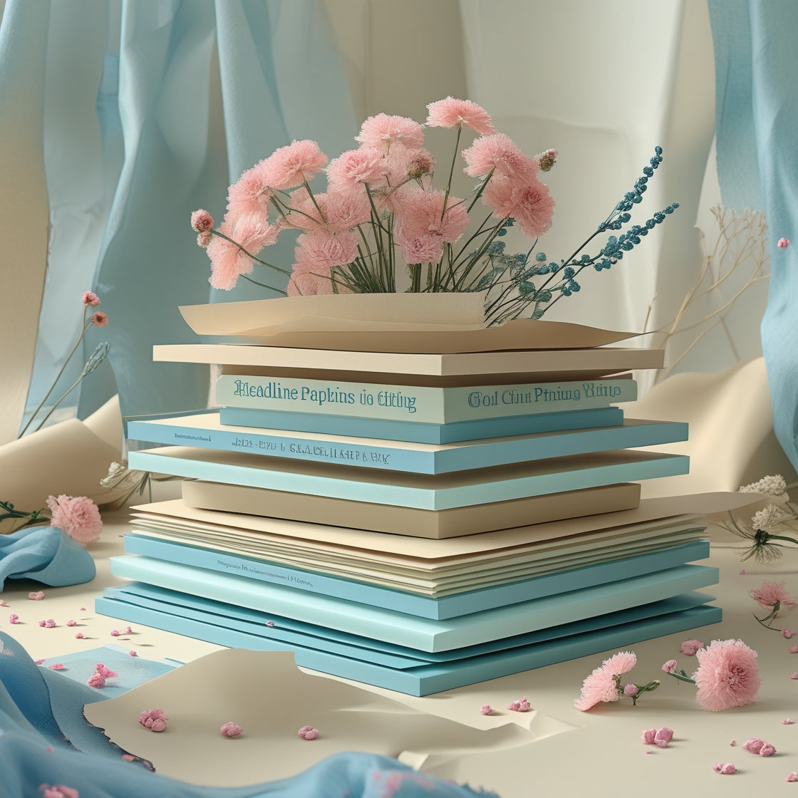
Collections to start with
-
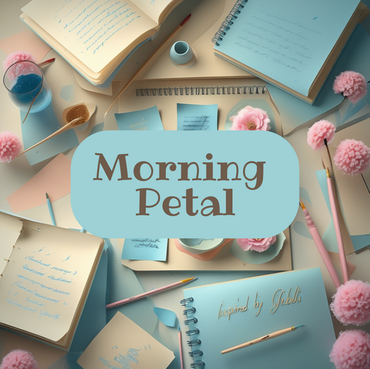
Morning Petal
Regular price $25.00 AUDRegular price -
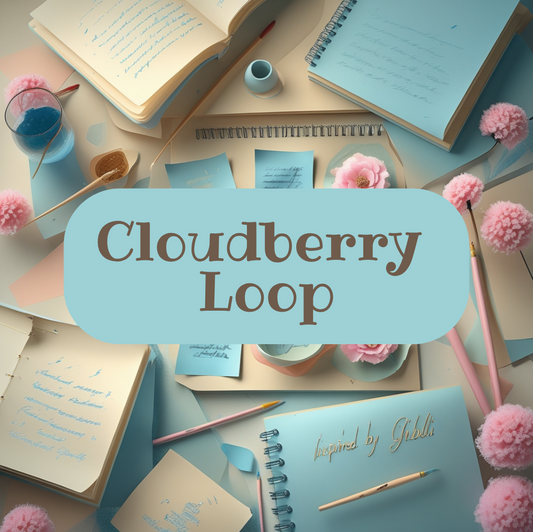
Cloudberry Loop
Regular price $40.00 AUDRegular price -
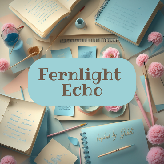
Fernlight Echo
Regular price $50.00 AUDRegular price -
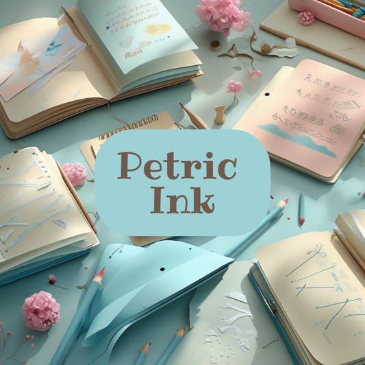
Petric Ink
Regular price $70.00 AUDRegular price
People behind Typolora
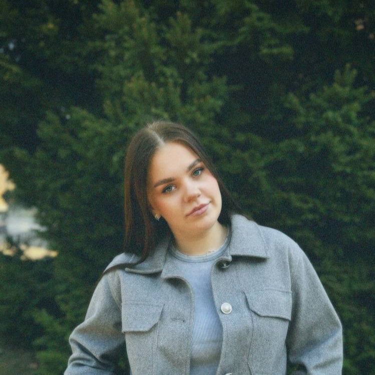
Emma Calloway
A designer who works with form as if she were creating an illustration. Her work is full of softness, inspired by nature, old diaries and the texture of paper. She carefully approaches each curve, working with an aesthetic of calm.

James Rowden
A composition editor who adores harmony and logical completion. His approach is precision, balance and understanding where exactly a letter should appear. He is responsible for the purity of the interaction between fonts in the collections.
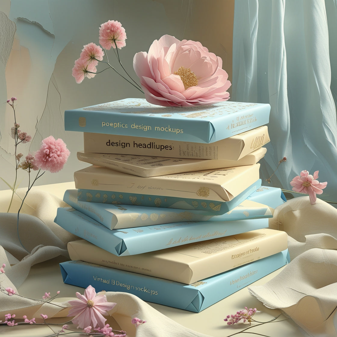
What is included in each font pack?
In the pack you will receive the fonts themselves in .OTF, .TTF and .WOFF formats, as well as examples of their use in different layouts. This allows you to immediately imagine the visual environment for each set. The number of variants depends on the package level.
What font formats do you use?
All sets include .OTF, .TTF, and .WOFF—universal formats for print and digital design.
What sets Typolora fonts apart from the rest?
Our collections are built around observation, mood, and a soft visual language. We work with natural lines, handwritten shapes, and details that don’t overwhelm the composition. Each font is designed to work harmoniously with the space, not dominate it.
What types of projects are your fonts suitable for?
Typolora fonts work well in projects where visual delicacy is important: page layouts, printed materials, packaging, personal notes. They easily adapt to different environments, digital or physical. Many of them have decorative variations that add character.
Does the quality of the fonts change when scaled?
No, all fonts are created in vector format, so they retain clarity regardless of size. This allows them to be used for both small inscriptions and large headlines. The main thing is to choose the right weight of the style.
Do you have decorative fonts with accents?
Yes, some collections include fonts with decorative details that add softness or emotional nuance. They are well suited for short words, titles or the design of individual phrases. These accents do not violate the overall harmony, but only enhance it.
Are fonts available for digital platforms?
All our fonts are compatible with most modern programs and websites that support fonts in .WOFF or .TTF format. This allows them to be integrated into the design of interfaces, presentations or web projects. Their structure withstands various types of display.